Project 1 - Self Portrait
Medium: Charcoal
Technique: One technique that I used and feel that I have mastered is drawing what you see using the grid technique. But while I feel I've mastered some techniques, there are some that I struggled with. One technique that I struggled with was blending and shading.
Inspiration: I got inspiration for my self portrait when I observed the artists in my class working on their self portraits. I found myself learning and using new techniques after seeing others in the class do the same thing. This was meaningful because it allowed me to learn new techniques that I will be able to use in the future. I chose these artists because they were literally next to me and it was easy to ask the artist themselves how to do that technique.
Evolution: My self portrait's evolution was long and started slow but eventually came together so that I could work quickly and effectively on my work. It started with making the grid and ensuring that the grid was in scale with the grid on my photo, after doing this, I learned and mastered drawing what you see, the grid was able to break this down for me making it more manageable. After doing this I made decisions on how dark to make the elements of my self portrait in order to make it the most realistic to my photo. Symmetry and different shapes in my face were especially hard for me to draw but these were good compositional elements to the production of my work.
Re-Do: If I could do something over, it would be the white highlighting on my face. I would change this because the white is poorly blended to my face and doesn't seem like it's it the perfect spot compared to my photo. Next time, I would blend my highlight better around its edges.
Connections: This piece is all about self and what words define you. The halo of words surrounding my face connects to the theme of self identity.

Project 2 - growing, Growing, GROWING
(MCA Art Show Submission)
Medium: Collage
Technique: This artwork was my first attempt at collage. One technique that I used and struggles with was the use of textured paper with photographs. I struggled with sticking the cut out photographs that I found to the textured paper that I was using. I also struggled in creating a cohesive look with the photographs and the textured papers together. But, in the end I found that I really enjoyed how it all came together. One technique I feel that I mastered was the technique of finding photographs in magazines and cutting them to match the idea that I had in my head.
Inspiration: I drew inspiration from all the collages that I have seen throughout my life. I found myself trying to imitate the more vintage looking collages that I have seen in the past which is why I used the textured paper as the background and why I tried to find more vintage looking clothing for the people I cut out.
Evolution: At the beginning I was just going to use an either white or black background behind the flower head figures I was making, when I was looking for paper I came across the cool looking textured paper that inspired me to go for a more vintage look like the collages that I'd seen before. Once I found the paper I decided to look for more vintage clothed people to create into flower heads. Once I did so, I found out that the piece looked more unified and put together than it would have if it had simply been a white or solid color background. I liked the contrast it created between the people.
Re-Do: If I could re-do this piece or add something to it, I would add another bigger person to replace the smaller man in the tuxedo. I would do this because I think it would create a better flow in my piece, and I think it would take away some of the blank space that is left in that area.
Connections: I think this piece connects to my other pieces because it focuses around differences between people and how they identify themselves, which connects to my theme of self identity. The different flowers represent the differences in people and how they identify.

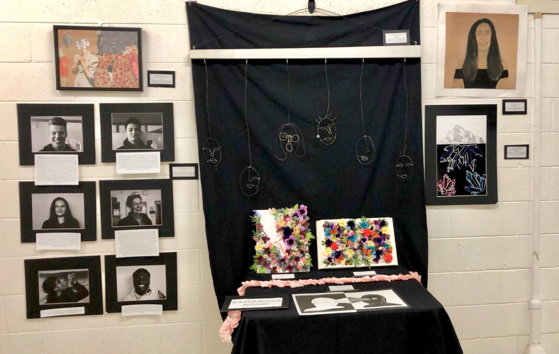
Project 3 - In Progress, Wire Faces
Medium: Wire
Technique: This is wire face artwork, I created different faces out of different width of wires. These faces are 2 out of 6 that I will be making for a bigger project where I will be hanging these from different lengths. The first face (The face with hair and glasses) I made by tracing a printed picture of myself with wire. I started with the thickest wire for the hair and base then moved on to a medium width wire for the glasses, nose and outside of the mouth. Lastly, I created the eyes and the inside of the mouth with the thinest wire. The next face was completed differently. I started by just making an oval for the face and then bending that same wire for the mouth. Then I made the nose and one eye separately. I then connected it all together with thin wire.
Inspiration: I was inspired by the self portrait idea on the GWHSIBART website. I thought about different mediums and came to the idea of a wire self portrait. Once I was finished with my first face, I thought many of them would look really cool hanging together. And that's how I came up with the project idea as a whole.
Goal: My goals for this artwork were to explore a new medium and see how it works out. I was trying to not feel frustrated trying out this new medium and I was successful in doing so. This artwork helped me to I just to just take my time and being in control with my movements with the wire. It helped me to keep calm and have fun taking my time with my work.
Connections: I'm not fully completed with my complete final project but I'm really happy with the way that these 2 faces turned out and really proud of myself for trying out a new medium and being successful with it. The faces will become a part of 6 faces total that will connect to my theme of self identity.

Project 4 - Completed, Wire Faces
Medium: Wire
Technique: Throughout this wire sculpture process, I explored many different wire techniques in order to give the wire shape and form. I mastered joining different parts of wire together using the looping, hook and eye, and simple hook techniques. I struggled in shaping the wire, I shaped wire when creating the different facial features. I struggled with creating the right and symmetrical shapes for the different facial features.
Inspiration: I was inspired from the wire sculptures by Gavin Worth. Gavin Worth makes a bunch of different types of wire sculptures, his are more realistic than mine are. I was inspired by the way his pieces flow and seamlessly come together to create a beautiful figure. I attempted to make my pieces come together as seamlessly as his do but I definitely struggled in doing so.
Evolution: I started out with making simple faces (like the 1st and 2nd Faces shown above) just to get the hang of how wire moves and how to change it to create shape. Once I had the hang of creating the different lines and shapes, I decided to start making harder faces (like the 3rd and 5th faces). This proved itself to be much more challenging than the simple faces I was creating before. I decided to push myself on the last 2 faces that I was making (4th and 6th faces). These were really difficult and frustrating to make but, in the end they are my favorite faces and I'm glad I pushed myself while making those.
Re-Do: If I could consider doing something over it would be not making so many simple faces and really pushing myself to make harder and more detailed faces for the entire project. I would do this because I think it would look much cooler to have more detailed faces hanging from the structure compared to a variation of simple and complex faces.
Connections: I think this project links with my other artworks because of the different faces which represent the different identities that someone could identity with. This connects to my theme of self identity, because it varies between being simple and more complex as you discover who you are throughout life.


Project 5 - Faces of George
(Click on Picture to Read Interviews)
Medium: Photography
Technique: Through this series, I tried different techniques such as manual focus in order to focus on the faces of the people that I was photographing. I struggled with figuring out what ISO was the best for different lightings that I was in when taking different pictures, but after trial and error after every photo, I think I have mastered figuring out which one ISO is the best for different lightings.
Inspiration: I gained inspiration mainly from Brandon Stanton who created the project 'Humans of New York' in this project he takes street portraits of random people in New York City and interviews to get different stories that they might have experienced in their life. I thought that his project is really cool, and definitely gained a lot of inspiration from his interviews.
Evolution: At the beginning of the project it was hard to think of interview questions that would lead to interesting stories from the subjects. I noticed that as the project continued the interviews continued to get better as the questions got more defined. After the photos were taken I learned about different proportions that I should keep in mind, this led to cropping different photos to fit the rule of thirds. This creates a good balance between the background and the focus.
Re-Do: If I were to do this project over, I would make sure that I was following the rule of thirds as I was taking the picture so I wouldn't have to worry about cropping the picture afterwords and losing parts of the picture that otherwise could have been kept.
Connections: This piece of artwork connects to my past pieces because, all of my pieces focus on humans most importantly their self identity. This is just a more focused view on the stories that make someone who they are and part of why they identify the way that they do.
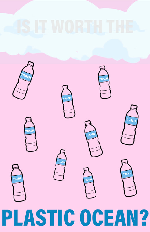
Project 6 - Raining Plastic Water
Medium: Graphic Print Poster
Technique: I used Adobe Illustrator to create this graphic poster. It was my first time using this program so it was interesting to learn about the different ways that you're able to do things. I think I mastered layering the different shapes and parts of the drawing that I used.
Inspiration: I was inspired by Luba Lukova, a graphic designer who makes social justice posters. Her use of block color and minimal words inspired how I decided to go about making my poster. I was also super inspired by the plastic ocean problem in the world right now. Mainly I was inspired by the amount of trash in our oceans and how marine life can't distinguish between food and plastic. Many end up dying because they have eaten a piece of plastic. I thought that this was the perfect opportunity to try it out.
Evolution: This piece evolved a lot. At the beginning I was just planning on having bottles floating on the page and nothing else. The clouds and the allusion that it was raining plastic evolved halfway through the piece. At the end I decided that I wanted to add words to make the message more clear.
Re-Do: If I could re-do this piece I would redo the size of the lettering to be bigger. I might even want to change what it says to be more impactful to the viewer.
Connections: This artwork doesn't really go with any of my other pieces. It's new and creates different ideas that I can now expand on.
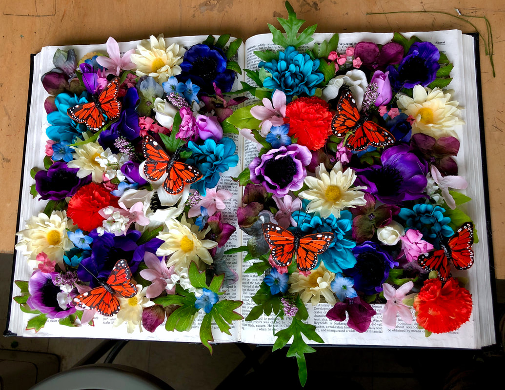
Project 7 - Blooms from Structure
Medium: Assemblage
Technique: The main technique that I used within this project was placement. It took a lot of time to find the perfect placement of where I wanted the flowers to be glued inside of the book and where to place the butterflies once all the flowers had been glued down.
Inspiration: The inspiration behind this piece was Kerry Miller's assemblage books. Miller makes similar art projects but instead of using 3D objects, she will paint them in a 3D looking way. I decided it would be cooler if I used actual 3D flowers in my art.
Evolution: I wanted to start out placing the flowers in an organized and uniform way, after placing half of the flowers in the book I decided that the art would look better if I put the flowers in a random order.
Re-Do: If I could re-do this piece I would make sure that when I carved the pages out of the book, I would glue them together to look more flatted out. I think would give the pages behind the flowers more ability to contrast from the flowers and give the piece more dimension. Next time, I would also not add leaves to the flowers, I think the leaves are unnecessary and make the organization of the flowers look messy.
Connections: This book connects to my theme of self identity. The book itself is an encyclopedia which represent the structure that is pushed onto the youth. The flowers represent everything that is inside of the youth but trapped behind the structure that is pushed by society. Self identity connects to this because there is so much more behind what meets the eye that makes a person who they are and how they identify themselves.

Project 8 - More Than What Meets the Eye
Medium: Graphic Print Poster
Technique: I used Adobe Illustrator to create this graphic poster. It was my second time using this program so it was still very new to me. I think I mastered aligning the different shapes and lines in the mountain and gems.
Inspiration: I was inspired by an iceberg poster made by, Nick Rubin. I was very inspired by icebergs because there can be a massive part to them that you can't see from the surface. Nick Rubin was able to illustrate this very well in his poster.
Evolution: In the beginning, I was only supposed to have one gem coming from the bottom of the mountain, but there was too much left over space that I decided to make more gems. I was also going to leave the poster in black and white but, I decided that the message would be more impactful if the gems were colored.
Re-Do: If I could re-do this poster, I would make the base of the mountain and the base of the gem the same so that they'd look like they were more a part of the same structure.
Connections: This connects to my theme of self identity. It represents how much more there is to someone besides what you see on the surface. The mountain is also very bland compared to the gems that are lying beneath it.

Project 9 - Flower Eyes
Medium: Drawing
Technique: In this art project I used different pen textures and strokes to create the people. The two main strokes I used were straight and curved lines. I had trouble with perfecting these lines and getting roughly the same line weight every time. I had to focus on the way that I was holding the pen in order to keep it consistent with the rest of the lines I had previously made. I also struggled with placement of facial features on the face. But, I feel like I mastered the different proportions needed to make a face look like a face.
Inspiration: I was inspired by tattoo artist, Curt Montgomery. Montgomery makes minimalist face tattoos and drawings. I really liked these faces and I decided to go off these faces to make my own minimalist faces to go with my theme.
Evolution: I started out with just making one face with straight lines coming from the lines. As I went on with the drawing I thought it would be cool to contrast the straight lines with flowers and vines to represent the lesser seen side of people in the world.
Re-Do: If I could re-do this piece I would make sure all the lines are straight and connected to make a seamless framing of the face. I would also add eyes to the black outlined face so that the two faces would look more even with each other.
Connections: This connects to my other drawing because it follows my theme of self identity. The black outlined face on the left represents the perfect person to society. The straight lines represent a direct path to a a goal that benefits society. The white outlined face on the right represents a person who isn't impacted by society and the way they want to get to the goals that they have made for themselves without societies help.
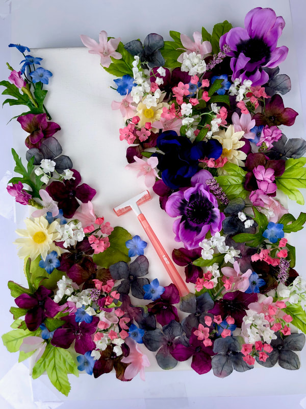
Project 10 - Shaved Blooms
Medium: Assemblage
Technique: The main technique that I used within this project was placement. It took a lot of time to find the perfect placement of where I wanted the flowers to be glued on the canvas.
Inspiration: The inspiration behind this piece was Kerry Miller's assemblage books. I was also inspired by Miller with my art piece "Blooms from Structure" I decided to expand on this art project by making this next art piece.
Evolution: I started out not even planning to have a razor on the canvas but, when I ran out of flowers I had to come up with a solution. So, I came up with the razor shaving away the flowers.
Re-Do: If I could re-do this piece I would buy more flowers so that I could make the piece more full. I would also add those flowers to under the razor to make the shave seem more realistic.
Connections: This connects to my theme of self identity. The flowers represent who we are as people and the razor represents society slowly cutting and shutting down the unique aspects and parts of us.